Color shapes the atmosphere of a room long before the details come into view. A well-chosen palette feels serene, unified, and intentional. The 60-30-10 principle provides structure and purpose, helping each hue contribute to the sense of balance and flow within the design.
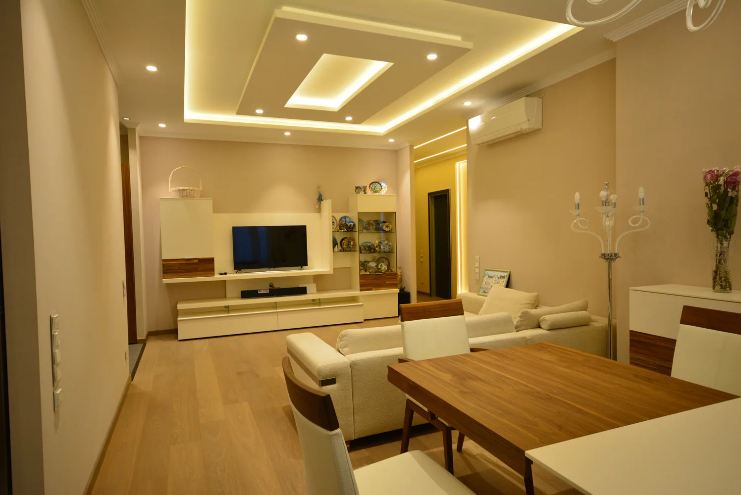
Sixty percent of a room should hold the dominant color, the base that establishes the overall atmosphere. It greets you the moment you enter and appears in the walls, large rugs, or key furniture pieces. This foundation should feel timeless and tranquil. Warm whites, soft taupes, and muted earthy tones allow the light to breathe and provide a subtle backdrop for contrast and depth.

A deep purple on the sofa works better than on every wall. Let the eye rest somewhere.
The final 10% is your accent color is what finishes the composition. These are your accessories, art, throw pillows, or lighting. That last bit of contrast for example a brass lamp in a cool-toned room, or a stripe of terracotta against cream this is what makes a palette feel alive. It’s not about boldness for the sake of boldness; it’s about precision. When everything else is quiet, the right accent commands attention.
I like to start with something that already works — a textile, a rug, a piece of art. Pull the palette directly from it.
The background tone becomes your 60%.
The mid-tone becomes your 30%.
The smallest, most saturated color becomes your 10%.
This approach guarantees harmony because you’re borrowing balance that already exists in the object.
Texture gives color its dimension. Without it, even great palettes fall flat. Every finish (matte, polished, rough, or woven) affects how light interacts with color.
A few reliable combinations:
Smooth paint with grainy natural wood.
Linen with leather or velvet.
Matte ceramics beside brushed metal or woven baskets.
Texture is what turns color into atmosphere. It’s the difference between a flat beige room and one that feels quietly layered.
Creamy Off-White (Walls)
Pale Gray or Soft Taupe (Walls, Sofa)
Warm Greige (Walls, Bedding)
Terracotta or Warm Brown (Chairs, Wood)
Navy Blue or Denim Blue (Curtains, Rug)
Charcoal Gray (Accent Wall, Headboard)
Deep Olive Green (Pillows, Vases)
Muted Brass or Coral (Lighting, Art)
Soft Rose or Rust (Throws, Books)
Sophisticated, and instantly cozy.
Calming, tailored, and refreshing.
Balanced, modern, and perfectly layered.
Once you understand proportion, you can experiment endlessly, blending undertones, shifting textures, and changing light. The 60-30-10 method isn’t about perfection; it’s about control. When your palette is balanced, when everything else like materials, shapes, and details finally clicks into place!
Subtle tones, layered textures, timeless calm
By following the 60-30-10 formula and consciously layering your colors and textures, you eliminate guesswork and create a space that feels harmonious, balanced, and perfectly composed every time.
By following the 60-30-10 formula and consciously layering your colors and textures, you eliminate guesswork and create a space that feels harmonious, balanced, and perfectly composed every time.
The 60-30-10 rule works beautifully for color, but it’s incomplete without texture. Texture acts like a fourth color, adding visual depth and interest even if you’re working within an all-neutral palette. It brings warmth, contrast, and a sense of touch to what might otherwise feel flat or overly coordinated.
Add Layers: In a neutral room, use your 30% and 10% areas to introduce contrasting textures. For example, a sleek leather sofa (60%) can be softened with a chunky knit throw (30%) and given an edge with a metal accent table (10%). Each texture has its own role, and together they create a balanced visual rhythm that draws the eye around the room.
Mix Finishes: Go beyond color by playing with surface qualities. A smooth, matte-painted wall becomes more dynamic when paired with a fuzzy wool rug or a glossy wooden floor. Between smooth and rough, soft and hard, matte and shine adds sophistication and a designer’s touch.
By combining the 60-30-10 color principle with thoughtful layering of textures and finishes, you take design from formulaic to phenomenal. Texture is what turns a pretty space into one that feels alive, welcoming, and perfectly balanced. When you master both color and texture, your interiors will always look and feel complete.